
I was standing in a sodden field in mid-October, shivering in my waterproofs and staring at a data sheet that made absolutely no sense. I’d spent six hours counting Bombus terrestris—the buff-tailed bumblebee—only to realize that my sudden spike in sightings wasn’t because the population was exploding; it was simply because a nearby farmer had just mown a wildflower strip, forcing them all into my tiny survey transect at once. It is the perfect, frustrating example of how correlation is confused with cause in ecology. People see two lines on a graph trending upward and immediately scream “success!” without asking if the two things are actually dancing together or just standing in the same room.
I’m not here to give you a lecture on statistical significance or hide behind academic jargon that leaves you more confused than when you started. Instead, I want to show you how to actually read the landscape of a data set. I promise to pull back the curtain on why flashy headlines often miss the mark and how you can spot the difference between a genuine ecological shift and a mere coincidence. We’re going to look at what the numbers are actually telling us, rather than what we want them to say.
Table of Contents
Why Statistical Significance vs Causality Isnt a Victory Lap

In my field, I see this mistake constantly. Someone will run a survey and find a p-value low enough to trigger a “statistically significant” result, and suddenly the local news is reporting a miracle. But there is a massive, dangerous gap between statistical significance vs causality. A significant result just means that what you observed is unlikely to be a fluke of random chance; it doesn’t mean you’ve actually found the driver of the population shift. You might have found a pattern, but you haven’t necessarily found the reason.
The problem is that in ecology, we rarely get the luxury of randomized controlled trials vs observational studies. I can’t go into a field and randomly assign some hedgerows to have wildflowers and others to have pesticides just to see what happens. I have to work with what’s there. This means I’m constantly fighting against identifying confounding variables—like a sudden heatwave or a change in local land use—that might be pulling the strings behind the scenes. If we treat every significant trend as a proven cause, we end up spending conservation budgets on the wrong things.
Avoiding Spurious Correlation Examples in Your Field Notes
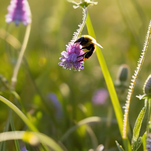
When I’m out in a field margin, my notebook is usually a mess of temperature readings, wind speeds, and insect counts. It’s easy to look at a page and see a pattern—say, a sudden spike in Bombus terrestris (the buff-tailed bumblebee) right when a specific wildflower blooms—and immediately declare a win. But this is where we trip over spurious correlation examples. Just because the bees and the flowers are peaking at the same time doesn’t mean the flower is the sole driver; a sudden warm spell might be the real engine behind both, making the link between them purely coincidental.
To avoid these traps, you have to get obsessive about identifying confounding variables. If you notice two trends moving in lockstep, ask yourself: “Is there a third, invisible factor pulling both strings?” In my field work, we rely heavily on observational studies, which are great for spotting patterns but notoriously bad at proving why they happen. Without the rigid structure of randomized controlled trials, you have to be your own harshest critic, constantly questioning whether you’ve found a genuine biological mechanism or just a statistical ghost in your data.
How to stop your data from lying to you: 5 ways to spot the trap
- Look for the “hidden driver” before you celebrate. If you notice that both wildflower density and bee activity are up, don’t immediately assume the flowers are the sole reason; it might just be a particularly warm, wet spring that boosted both independently.
- Question the “why” behind the coincidence. When you see two trends moving in lockstep, ask yourself if there is a biological mechanism that actually connects them, or if you’re just looking at two different symptoms of the same weather pattern.
- Beware of the “small sample” siren song. A sudden spike in a specific moth population in your garden might look like a local recovery, but if your data set is only three weeks of observations, you’re looking at a snapshot, not a trend.
- Distinguish between “presence” and “abundance.” Just because a species shows up in a survey after you’ve planted a new hedge doesn’t mean the hedge caused the population to grow; it might just mean you’ve finally made the area attractive enough for them to wander through.
- Check for the “lag time” reality. Biological responses aren’t instant; if you change a management practice today, you shouldn’t expect to see a causal shift in insect numbers tomorrow. If the numbers jump immediately, you’re likely looking at a correlation with something else entirely.
How to spot the difference before you hit 'publish'
Stop treating a p-value like a magic wand; just because a trend in your transect data is statistically significant doesn’t mean you’ve actually found the smoking gun for why a population is dipping.
Look for the hidden variables—if you see more pollinators in a garden, check if it’s because of your new wildflower patch or simply because it was an uncharacteristically warm Tuesday.
Embrace the “we don’t know yet” in your writing, because being honest about thin evidence is much better for your credibility than making a leap that a skeptic can dismantle in one sentence.
Moving beyond the headline
At the end of the day, distinguishing between a trend and a mechanism is what keeps our conservation efforts from spinning their wheels. We’ve looked at why a statistically significant spike in a specific moth population doesn’t automatically mean your new wildflower patch is the sole reason for it, and why we have to be careful not to mistake a seasonal coincidence for a long-term recovery. If we jump to conclusions every time two data points align, we risk investing time and money into solutions that don’t actually address the underlying drivers of decline. We have to be willing to sit with the uncertainty of a correlation until the actual causal link is dragged into the light through better, more rigorous study.
This isn’t about being cynical or slowing down the momentum for insect protection; it’s about building a foundation that is actually unshakeable. When we demand better evidence, we aren’t being difficult—we are ensuring that when we finally do say “this works,” we can back it up with more than just a lucky guess. The insects don’t need us to be loud and alarmist; they need us to be precise and persistent. Let’s focus on the real mechanics of the landscape, because that is where the genuine, lasting change happens.
